The Making of a Book Cover
The cover is as important to a book as the story, the characters, and the dialogue behind it. A great cover captures the essence of the story in a single picture; it helps the reader create pictures in his or her mind's eye of the main character, the setting, and even the style of the writing and the mood of the story.
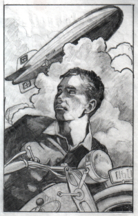 Artist Ron Blalock did a lot of background research before he began his initial design sketch. I sent him reference pictures of the Graf Zeppelin II, the airship on which much of the action takes place. Ron found an excellent picture of the type of motorcycle that I had in mind (yes, like the Graf Zeppelin II, the motorcycle was based on the real thing, though the name of the manufacturer did not make it into the final draft -- for the record, the motorcycle is a Zuendapp DB200). He also consulted books with pictures of German movie posters from the late 1930s. When he had all the information he needed, Ron drew his first black-and-white sketch of the cover. Artist Ron Blalock did a lot of background research before he began his initial design sketch. I sent him reference pictures of the Graf Zeppelin II, the airship on which much of the action takes place. Ron found an excellent picture of the type of motorcycle that I had in mind (yes, like the Graf Zeppelin II, the motorcycle was based on the real thing, though the name of the manufacturer did not make it into the final draft -- for the record, the motorcycle is a Zuendapp DB200). He also consulted books with pictures of German movie posters from the late 1930s. When he had all the information he needed, Ron drew his first black-and-white sketch of the cover.
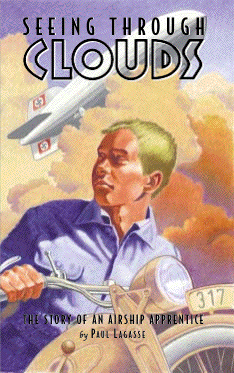
This is the first time that I had ever "seen" Erich. I think Ron captured the image I had of Erich in my mind's eye. I especially like the sense of suspense that Ron gives his pose. Is he looking over his shoulder in fear? Or in anticipation? Is someone coming after him? It captures the complex moods and emotions that Erich feels throughout the story. And of course the motorcycle and the Zeppelin look great! The design really has a "movie poster" feel, I think.
 The next step was to come up with the lettering for the cover. Ron found a stack of old German magazines from the 1930s and 40s, and inside were a treasure trove of interesting styles of lettering. Ron drew up nine different layouts using the best fonts, writing each one on a transparent sheet that he then placed over the cover sketch to see how it looked. He scanned each one and sent them to me to review. Looking them over with Mary Jo, we picked the one that we thought worked the best with the cover drawing. The next step was to come up with the lettering for the cover. Ron found a stack of old German magazines from the 1930s and 40s, and inside were a treasure trove of interesting styles of lettering. Ron drew up nine different layouts using the best fonts, writing each one on a transparent sheet that he then placed over the cover sketch to see how it looked. He scanned each one and sent them to me to review. Looking them over with Mary Jo, we picked the one that we thought worked the best with the cover drawing.
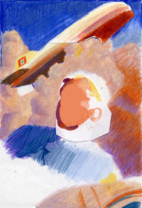 Time for color! Ron drew a color test to get a feel for how the different colors and shadings were going to work. The color of the uniform and the motorcycle look right. I suggested that the Zeppelin should be shades of silver rather than the reddish-golds in this version. While in real life Zeppelins often reflected these colors when flying at sunset, the color most identified with them is the silver of their metallic paint. Ron also decided that the blue of the sky was a little too deep. Time for color! Ron drew a color test to get a feel for how the different colors and shadings were going to work. The color of the uniform and the motorcycle look right. I suggested that the Zeppelin should be shades of silver rather than the reddish-golds in this version. While in real life Zeppelins often reflected these colors when flying at sunset, the color most identified with them is the silver of their metallic paint. Ron also decided that the blue of the sky was a little too deep.
Ron used Prismacolor color pencils for the cover. He explained that Prismacolor pencils are like colored pencils, but the lead is more waxy. This makes the texture softer and deeper than you can get with ordinary colored pencils.
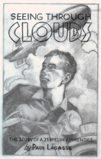
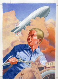 And here's the final result! The cover was drawn at 150% size, so that it would have a very sharp resolution when reduced to the size of the actual book cover. The Zeppelin looks like a photograph, it's so realistic. And here's the final result! The cover was drawn at 150% size, so that it would have a very sharp resolution when reduced to the size of the actual book cover. The Zeppelin looks like a photograph, it's so realistic.
See those straight lines drawn in the corners? Those are alignment marks that indicate the borders of the actual cover when it's printed.
So why "color outside the lines?" Ron explained that in printing, you need to have a little extra on all sides because sometimes the cover ends up being a little smaller or a slightly different shape than what you planned on. The extra margins mean that you won't end up with blank space if that happens.
Ron recommended his friend Bill Gordon, a graphic designer, to do the cover layout. Layout means creating the front and back covers and the spine in between, as well as the words and pictures on them.
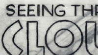
 Bill selected the fonts (the style of letters) to match the style that Ron had come up with, but Ron had to hand-draw the word "CLOUDS" for the cover because no one made those letters anymore! Bill selected the fonts (the style of letters) to match the style that Ron had come up with, but Ron had to hand-draw the word "CLOUDS" for the cover because no one made those letters anymore!
And that's the story of how the cover for Seeing Through Clouds came to be.
|